Last month at our European networking event, Connect, Lightspeed officially announced our brand new theme store. Beyond the obvious aesthetic improvements that the new store brings — and there were a sure lot of them — the new theme store was primarily developed and built with clear goals in mind: helping Lightspeed customers find the theme that is best suited for their brand, make their online store easier to navigate, help them gain more visibility on Google and, at the end of the day, get more customers.
When we started planning out our new Theme store, the user experience was at the core of the changes that we wanted to make. We wanted to make it easy and fast for anyone to find the best theme for their online store without needing the assistance of a sales or support representative. We also wanted a sleek and organized way to display our rock star eCom product, because first impressions are everything.
Sure, that’s interesting, but what’s in it for you? How will you benefit from the changes made within the theme store?
Vertical categories
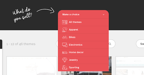
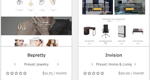
You own an apparel store? A bike store? You will now be able to easily find the right theme to match your specific business type. All themes are separated by industry and the verticals can be identified at a glance. To identify the ideal vertical per theme, you have two options:
- Clicking on the dropdown menu “what do you sell”.
![We gave our theme store a makeover | Lightspeed POS]()
- Browse through the verticals by clicking the arrows under each image.
![We gave our theme store a makeover | Lightspeed POS]()
Additional filters
If you already know what you’re looking for, use the specific filters on the left hand side to sort through the different themes. You can even filter by specific features of a theme, like the popular “Shop the Look” or “Search Predictions”. If you’re new to running an online store and aren’t so familiar with all these eCom terms, check out the theme’s detail page for clear descriptions.
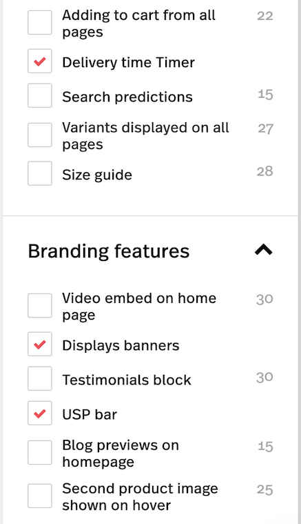
Presets
Instead of listing every theme preset individually like we did before, now they’re all grouped together as one, so this makes it a lot easier and faster to scroll through all our themes.
What’s a preset, you ask? It’s our way of tailoring a theme into slightly different iterations so that it can cater to different industries, brands or visual identities. As an example, check out our theme Exclusive, and click through the 4 presets on the right hand side: Default, Onepager, Design, and Boutique.

Preview across devices
Get a quick preview of the theme on all devices before settling on the winner. This is especially valuable for those who know whether the majority of traffic to their website comes from mobile or desktop systems.

Partner information
If you have any questions about the theme, support and partner information are now clearly listed and easy to find.
Better search capabilities
A brand new search bar! If you already know what you want want, you can now search for it using keywords in the search bar right at the top of the screen.
Lightspeed is always on the lookout for ways to better our product. This new theme store not only helps Lightspeed users find the theme that works best with their brand and creates a better shopping experience, but also helps shoppers find them online gets them more business. At the end of the day, our goal is to help our customers grow their businesses by creating truly unique omnichannel shopping experiences.
Want to see more?
Check out our newly revamped theme store.

News you care about. Tips you can use.
Everything your business needs to grow, delivered straight to your inbox.
