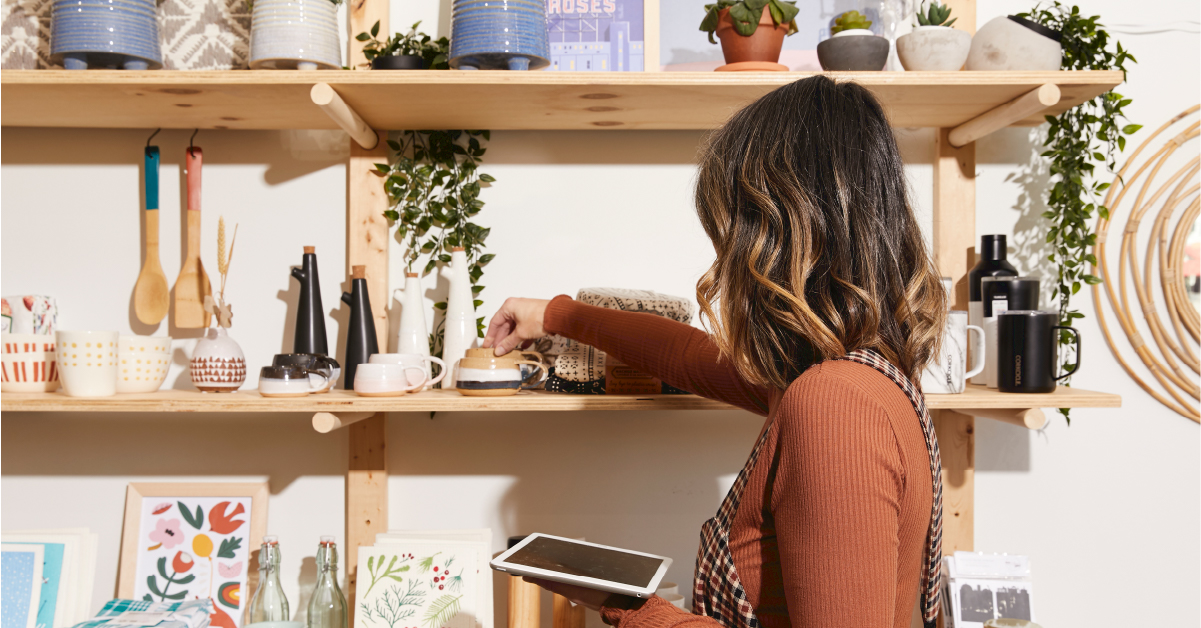
First impressions count, and when it comes to retail, they mean the difference between a new customer and a lost sale. Your store needs to be consistently on its A-game, delivering the best visual representation of your products. For a retailer, this means having a visual merchandising strategy.
Visual merchandising encompasses everything from storefront displays and product displays to in-store signage. Providing a visually pleasing experience is the first step in establishing a connection with shoppers coming to your physical store. By leveraging different design techniques, you can quickly transform your store into an aesthetic experience your customers will love.
Let’s dive in.
- What is visual merchandising?
- Who does visual merchandising?
- What is the purpose of visual merchandising?
- 9 visual merchandising tips and techniques
- How to measure visual merchandising strategies
What is visual merchandising?
Visual merchandising is a widely-adopted practice in the retail industry that aims to enhance the overall shopping experience for customers. It usually involves creating visually appealing displays and arranging products to capture attention, communicate the brand’s message, and ultimately drive sales.
The goal of visual merchandising is to engage and inspire customers, creating a unique and immersive environment that encourages them to make a purchase.
While visual merchandising can cover a range of aspects within a retail store, there are two key elements that every successful visual merchandising strategy should include.
1. The use of attractive displays
This involves carefully selecting and arranging your products in a visually pleasing manner. For example, in a clothing store, a well-executed display could feature a mannequin wearing a stylish outfit surrounded by coordinating accessories. By showcasing the products this way, customers can envision how they might look when wearing the clothes, leading to increased interest and sales.
2. The use of signage and graphics
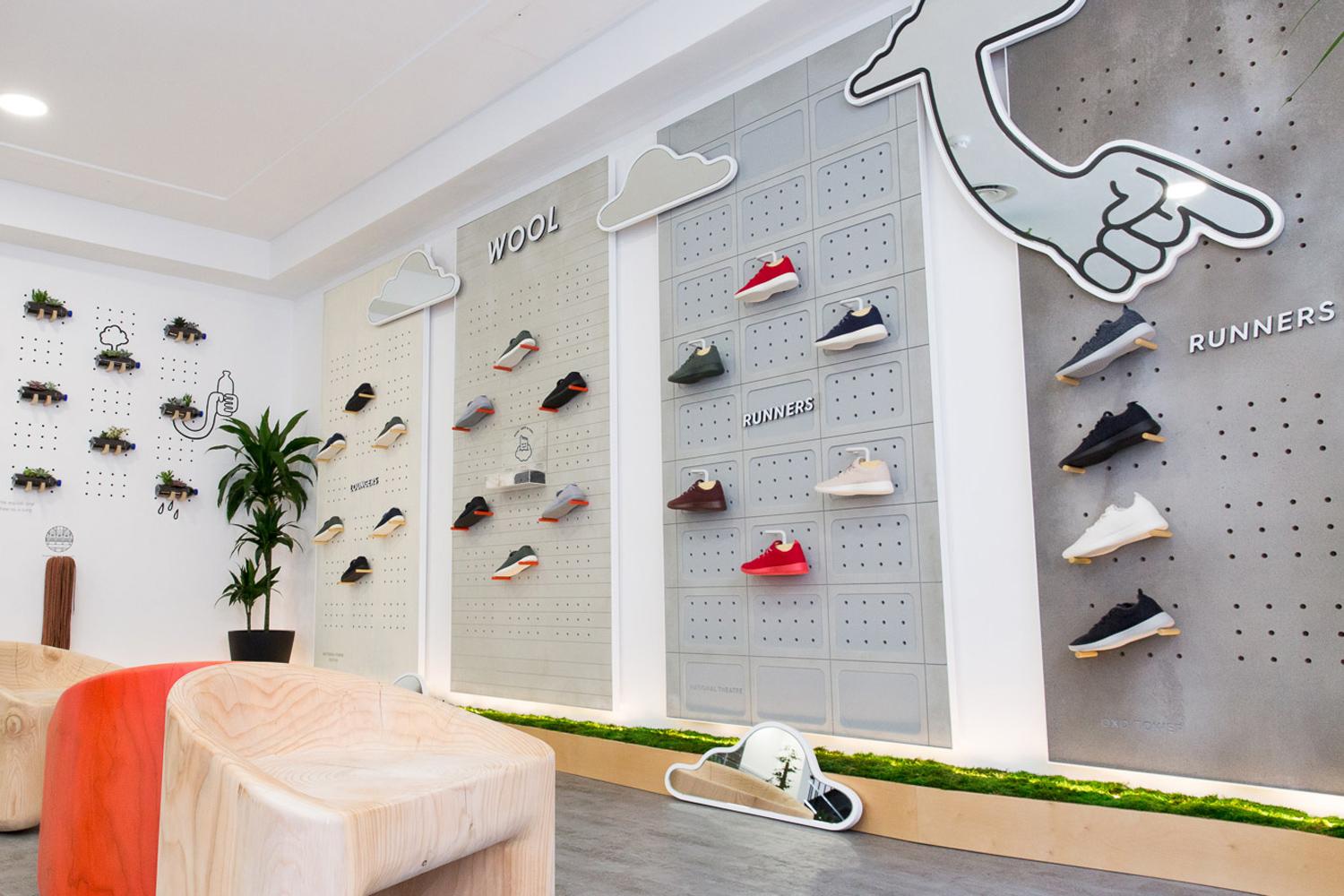
Signs are a powerful tool that will help you to communicate information about your products, promotions, and brand identity. For instance, a grocery store might use colourful signage to highlight special offers or advertise seasonal produce. Cleverly designed graphics can also create a sense of brand personality and establish a cohesive visual identity throughout the store.
Who does visual merchandising?
Visual merchandising is a specialist job role performed by a visual merchandiser.
In larger companies, merchandisers work with the retail marketing teams to build product displays that fit the brand’s image and guidelines. On the other hand, independent retailers have more control over what the displays look like and more room for creativity.
Visual merchandisers require diverse skill sets, combining creativity, attention to detail, communication skills, and industry knowledge. By leveraging these skills, they can effectively curate attractive displays, create a seamless store environment, and enhance the overall shopping experience to drive customer engagement and sales.
Visual merchandisers can also be used to tailor your online shopping experience, and this is often referred to as virtual merchandising. Similar to visual merchandisers, these professionals combine their creativity and analytical skills to curate and optimise the online shopping experience for your eCommerce store.
What is the purpose of visual merchandising?
The main purpose of visual merchandising is to attract and engage customers and motivate them to make a purchase through several key tactics.
Captivating attention
Visual merchandisers seek to create an inviting and visually appealing store environment through eye-catching displays, signage, and lighting techniques. In turn, this aims to attract customers, draw them into your store, and pique their interest in the products being showcased.
Communicating brand identity
Through the use of strategic visuals, colour schemes, signage, and displays, your brand’s personality, style, and unique selling points can be conveyed to customers. This helps to build brand recognition and fosters an emotional connection with customers, ultimately influencing their purchase decisions.
Enhancing product visibility and sales
A key objective of visual merchandising is to optimise the visibility of your products to create an environment that encourages sales. By strategically placing products, arranging them in visually appealing ways, and utilising effective signage and promotional materials, visual merchandisers can increase product exposure and highlight key items or promotions to drive customer engagement. This can lead to higher customer interest, longer dwell times, and increased conversion rates.
Creating a memorable shopping experience
Visual merchandising seeks to create a memorable and immersive shopping experience for customers. Visual merchandisers aim to evoke positive emotions, provide inspiration, and enhance customer satisfaction by carefully curating the store layout, product displays, and ambience. A well-designed and thoughtfully executed visual merchandising strategy can leave a lasting impression on customers, encouraging repeat visits and word-of-mouth recommendations.

9 visual merchandising tips and techniques
While the prospect of implementing visual merchandising strategies might seem daunting, you can follow several quick and easy tips to create beautiful displays that showcase your products to convert more people into paying customers.
1. Understand your target customer’s psychographics
Understanding your target customer is the first step to creating an effective visual merchandising strategy.
By that, we don’t just mean understanding demographic data like their age, income and education; dig deeper into their psychographic information to understand what drives their decisions and their lifestyle.
An excellent place to start is by combing through the customer data on your point of sale system (especially a customer’s order history!)
2. Get inspired
Thanks to the internet, sources of merchandising inspiration are nearly endless. Before you build your displays, spark your imagination by skimming resources like Pinterest, Smart Retailer and Design Retail Online for storefronts that have created eye-catching product displays.
3. Appeal to the 5 senses
While focusing on your product display’s visual look is tempting, don’t neglect the other four senses.
The secret to a truly experiential retail store is creating a multi-sensory experience. Here are a few ways you can create product displays that engage with each of the five senses:
- Sound: when curating your store’s playlist, think of your target customer and what they listen to: you want the music to appeal to them, first and foremost.
- Touch: give your customers the ability to touch, feel and test out whatever you’re selling. This helps customers foster a sense of ownership over the product they’re holding and increases the probability that they’ll buy it.
- Smell: if someone smells something they like, it’s automatically registered as a positive memory. Therefore incorporating scent marketing can help create positive associations, attract customers and encourage them to return.
- Taste: if your store sells consumables, let customers sample products before they buy – like letting customers try on clothes. Plus, there’s some psychology behind it. Customers who receive a free sample often feel a need to reciprocate, usually by buying the product.
- Sight: from using colours to playing with lighting, merchandisers need to control where and what a customer looks at in-store.
4. Use design theory to build your displays
Your displays are a critical part of your overall design and can easily make or break the flow of your store. Understanding key design theory will help you build eye-catching displays with your in-store design.
When building your displays, keep these four design theories in mind:
- Balance – a balanced store display guides customers and provides a cohesive experience. Symmetrical displays can add consistency and order, whereas asymmetrical designs can add an exciting touch to your display, focusing on certain elements in your design.
- Contrast – choosing certain colour schemes can help contrast your displays, so you can emphasise certain products within your store.
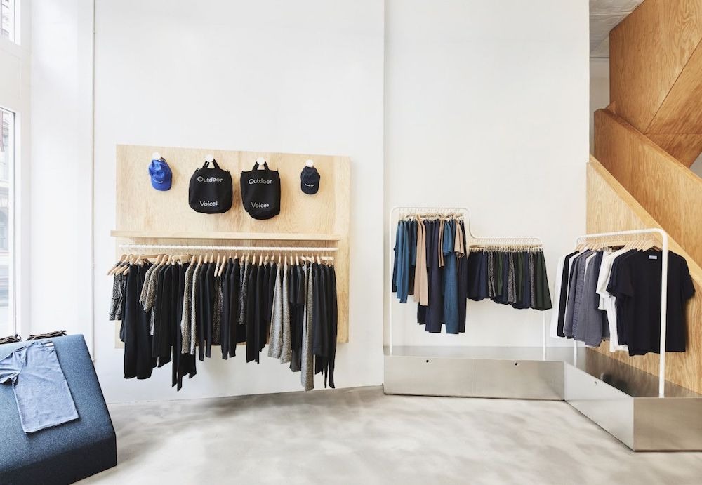
- White space – don’t fill every inch of space with displays or products. White or negative space will help highlight specific displays or products, adding a focal point and reducing clutter.
- Unity – don’t go overboard with too many displays or signs. Creating unity amongst all your in-store displays, decorations and design will create a sense of cohesion and help you stay on brand.
Ultimately, when it comes to your visual merchandising, you don’t want your customers to get lost in a sea of products. These design tips will give you a focal point within your displays and help guide your customers’ eyes to particular products or sections.
Retail giants like Apple have mastered the art of creating in-store experiences, so much so that their stores are instantly recognisable worldwide. Apple is well known for its use of white space and minimalist and modern in-store displays, which keep the products centre stage, allowing customers to use and feel them as they go along without creating clutter.
5. Guide customers through your store
IKEA has become a worldwide example of how to guide customers through a store. Their maze-like concept groups products by living space and takes buyers through a home shopping journey.
Have you ever gone to IKEA and left the store with more products than planned? Their path-like concept means you can’t see what’s coming next, instilling a need to stay on course and pick up more items along the way. This ultimately generates a sense of ownership over the products, decreasing the chances that you’ll put them down before you get to the checkout.
While you might not have the same space or concept as IKEA, the same rules apply. Grouping products that share a similar theme makes your store easier to navigate and allows customers to browse by category and find additional add-on purchases along the way.
6. Group products that are commonly bought together
Cross-merchandising is a great way to improve your in-store experience.
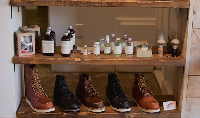
Cross-merchandising is similar to cross-selling – strategically arranging your displays with complementary or related products makes it easy to encourage additional sales and increase customer satisfaction. Cross-merchandising is a great way to increase your customers’ average basket size. By conveniently placing products that go well together, you make their shopping journey much more accessible and give them ideas they might not have thought of before.
Using a point of sale with reporting capabilities lets you easily find data about what products to cross-sell and how to arrange your displays. For example, with Lightspeed Analytics’Commonly Bought Together report, you can search different combinations of products that customers have purchased in the past, allowing you to craft the perfect display set-up and also create your point of sale marketing strategy.
7. Routinely refresh your product displays
Your store’s design isn’t meant to stay the same. Every time you have new, noteworthy inventory or transition from one season to another, you should consider refreshing your store’s merchandising, displays, layout and signage.
Times change, and so do your customers, so it’s recommended that merchants update their product displays on a monthly basis. Keeping your store relevant goes hand-in-hand with your design and how and when you update it. When creating your store design, opt for something you can adapt with time.
At the end of the day, your store’s look will depend entirely on your products and your brand and how you want to connect with customers. Take the time to understand your brand and translate that into your in-store design. Ultimately, you need to create the design that’s right for you.
8. Use the rule of three
The “rule of three” is a commonly used principle in visual merchandising that suggests grouping items or elements in sets of three to create visually appealing and balanced displays. Here are some ways you can use the rule of three in your visual merchandising:
- Grouping products in sets of three can create an organised and visually appealing arrangement. For example, in a clothing store, displaying three mannequins wearing coordinating outfits can effectively showcase different pieces and accessories while maintaining a sense of cohesion.
- Varying heights and sizes of displayed objects can add visual interest. For instance, arranging three different-sized vases or three staggered display shelves can create a sense of depth and dimension.
- Colour coordination, such as three complementary or contrasting colours, can add visual impact. For example, a display featuring three products in different shades of the same colour can create a visually harmonious arrangement.
It’s important to note that the rule of three is not strict but a guideline that can be adapted and applied creatively to suit different contexts and aesthetics. Visual merchandisers can experiment with other groupings or variations while keeping the principles of balance, visual interest, and coherence in mind.
9. Don’t forget the decompression zone
The decompression zone, also known as the “transition zone” or “decompression area,” is an essential concept in visual merchandising that refers to the entrance or first few feet of a retail store. It’s where customers transition from the outside environment to the store’s interior and begin their shopping experience.
The purpose of the decompression zone is to create a welcoming and inviting atmosphere, allowing customers to adjust to the store’s environment and take in the overall layout and ambience. It serves as a buffer zone that eases the transition from the outside world to the retail space, allowing customers to shift gears and begin focusing on the shopping experience.
The fundamental principle of the decompression zone is to keep it visually uncluttered and free from overwhelming displays or merchandise. It is typically designed with a more open and spacious layout, featuring simple decor, neutral colours, and minimal signage. Keeping this area relatively clear of product displays prevents customers from feeling overwhelmed and helps them orient themselves within the store.
Strategically, the decompression zone allows retailers to make a positive first impression and set the tone for the shopping experience. It may feature attractive displays or signage that reflect the brand’s identity and values, helping to establish a sense of the store’s offerings and unique selling points. Additionally, it can be used to highlight key promotions or new arrivals to capture customers’ attention and generate interest.
How to measure visual merchandising strategies
Measuring the effectiveness of visual merchandising strategies is important to assess their impact on customer engagement, sales, and overall store performance. Here are some key ways to measure your visual merchandising strategies:
Sales and Conversion Rates
To evaluate the success of your visual merchandising, analyse the sales performance of specific products or categories that were part of the strategy. Look for increased sales, conversion rates, and average transaction value. Comparing these metrics before and after implementing visual merchandising changes can provide insights into its effectiveness.
Customer Feedback and Surveys
Collecting customer feedback through surveys, interviews, or feedback cards can provide valuable insights into their perceptions of your visual merchandising strategies. Ask specific questions about the impact of displays, the clarity of product presentation, and the overall shopping experience. Customers’ feedback can help identify improvement areas and validate the effectiveness of visual merchandising efforts.
Testing and Experimental Approaches
Implement testing or experimental approaches to evaluate the impact of different visual merchandising strategies. For example, display two different arrangements or layouts of products and measure the difference in sales or customer engagement between the two variations. This allows for direct comparison and identification of the more effective approach.
Observational Analysis
Conduct systematic observations or use video recordings to analyse customer behaviour within the store. Observe how customers interact with specific displays, whether they stop, touch, or engage with the products, to understand if your visual merchandising strategies effectively guide customers’ attention and influence their purchasing decisions.
By combining these measurement methods, retailers can understand the effectiveness of their visual merchandising strategies. This data-driven approach helps to identify successful strategies, make data-backed adjustments, and optimise the visual merchandising efforts for improved customer engagement and sales performance.
Get started with your visual merchandising
Visual merchandising is a powerful tool retailers can use to create engaging and immersive shopping experiences. By following key tips and techniques such as understanding your target customer, cross-merchandising and applying the rule of three, retailers can create captivating displays that drive customer engagement and sales.
By prioritising visual merchandising and implementing effective strategies, retailers can create an aesthetic and immersive environment that sets them apart from the competition and encourages repeat visits from satisfied customers.

News you care about. Tips you can use.
Everything your business needs to grow, delivered straight to your inbox.


