2018 and 2019 were great years for restaurants in the Australia. Restaurant sales grew from $32.3 billion in 2018 to $33.1 billion in 2019. That growth is largely in part to restaurateurs increasing their margins and approaching their menu design more strategically.
There’s no doubt that the restaurant industry is on the upswing. Customers are spending more, which is a great opportunity for you to capitalise on. But when there’s an opportunity, there’s typically fierce competition.
That’s why we’ve written the definitive guide for restaurant menu design. In this blog, we’ll cover:
- How to design a profitable restaurant menu
- How to write a restaurant menu
- How to create a cocktail menu
Let’s dive in!
Create your menu in minutes
You don’t need to be a designer (or hire one) to create a beautiful menu. Download your free, easily-customisable menu templates today.
How to design a profitable restaurant menu
Your menu should represent the spirit of your establishment, stand out from the competition and scale your profits. To do that, we’ve broken menu design into five actionable steps:
- Analyse your sales reports
- Create a menu matrix
- Adjust menu item prices
- Select which dishes to feature
- Choose your menu layout carefully
1. Analyse your sales reports
This first step is the most important—to improve your menu, you need to base your decisions on data. Data is the best way to quantify your menu’s effectiveness, grow profits and measure results. Thankfully, your point of sale should be able to pull intuitive sales reports without a hitch.
Note: If you’ve yet to open your restaurant and have no historical sales data, you can skip directly to Step 3, which focuses on pinpointing how to price menu items to account for the cost of goods sold (COGS), labor and overhead expenses while still turning a profit with each sale.
For example
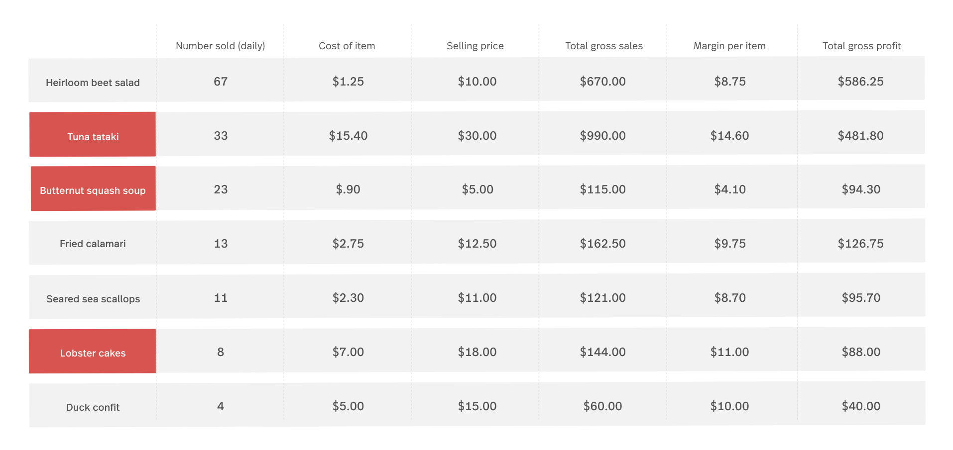
Imagine this is your appetiser menu’s monthly sales data.
Your sales data indicates that the butternut squash soup is popular and could probably earn you more profit, so you decide to raise the selling price from $5.00 to $5.95, a boost that you don’t think will negatively impact its sales volume.
You also raise the selling price of the popular tuna tataki dish by $2.00 and decrease your lobster cake’s price by $1.05, which you project will increase its sales by 50%.
Before adjusting the selling prices of these menu items, your total monthly gross sales were $1,249.00. Assuming your monthly sales of these menu items remain consistent, your total gross sales after adjusting their selling prices will be $1396.25.
That’s 147.25 in additional revenue per month and $1,767.00 per year!
And that’s only from adjusting three menu items. Repeat this exercise for each of your popular menu items to raise that number even further.
2. Create a menu matrix
Now that you have a good understanding of your menu item’s profitability, the next step is to create a chart to categorise each menu item based on its sales volume (popularity) and profitability.
We call this chart a menu matrix.
What is a menu matrix?
A menu matrix is an instant visual aid used to map out the sales volume and gross income of each menu item you sell. Simply put, it helps you get a clearer understanding of which menu items are the most important for your establishment’s financials (and which drinks you want to draw the most attention to using menu design tricks, but we’ll cover that in Step 5).
How to create a menu matrix
Start by plotting your current menu items on an X and Y axis based on their popularity and profitability. Each item falls into one of these four categories:
- Cash cows: Low profit, highly popular menu items. Customers love these menu items, but they aren’t profitable—yet. Consider adjusting their prices as we did with the butternut squash soup and tuna tataki. If they continue to be very popular, you just created star menu items.
- Stars: High profit, popular menu items. You want to draw as much attention to these menu items as possible. Along with emphasising them in your menu design, have bartenders and servers suggest them to indecisive customers.
- Duds: Low profit, low popularity menu items. You don’t need to cut these items from your menu per se. Sometimes reworking either their price or their ingredients is all you need to turn them into stars. Ask customers for feedback to see how you can tweak it and then see what customers think of the reworked recipe. Is it a hit or a miss? If sales remain low, consider removing the item from your menu altogether.
- Puzzles: High profit, low popularity menu items. Consider renaming this item, changing the way it’s described in your menu or having your servers and bartenders suggest it to guests more often to drive sales. These items have untapped potential.
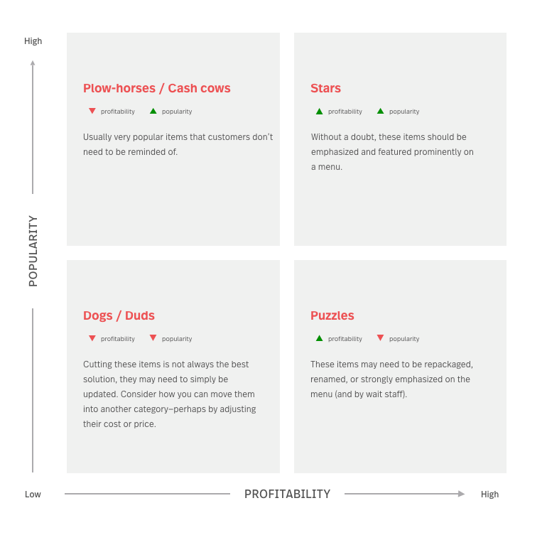
Once you complete this exercise, you’ll have a clear understanding of which menu items to prioritise, rework or remove from your menu to maximise sales and profits.
3. Adjust your menu item prices
Imagine you sold a high volume of your cash cows, stars and reworked puzzles, but were still operating your business at a loss. That’s exactly what we want to avoid.
Typically when this happens it’s due to having set prices that don’t cover COGS, labor and overhead expenses, as well as profit once all those expenses are paid for.
The markup of your menu items is largely influenced by your cost of goods sold, labor costs and overhead expenses (like your commercial space’s lease), each of which account for roughly one-third of your restaurant’s revenue each.
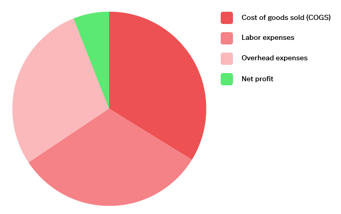
Once all these expenses are paid, restaurants are usually only netting between 2% and 6% profit off of each sale.
Of course, your markup will also depend on your restaurant type. Fine-dining restaurants typically sell a lower volume of dishes and have a higher cost of goods sold. As a result, they charge more per dish. Alternatively, quick-service and fast-food restaurants sell a higher volume at a lower cost.
Calculate your total monthly expenses and determine your menu item prices so that you’re able to pay those expenses and still turn a profit at the end of each month.
4. Select which dishes to feature
Let’s dive into the psychology of choice.
Put simply, FOMO (fear of missing out) is a real thing and having too many menu items isn’t ideal. When confronted with too many options, customers have a harder time deciding what they want and are more likely to be unsatisfied with the choice they do make (“I wonder if I should have bought the tuna tataki instead?”).
How many menu items should you have?
A study from Bournemouth University found that the answer depends on what type of restaurant you run.
For fast-food and quick-service restaurants, the sweet spot was six menu items per category (starters, fish, chicken, steaks and burgers, grills and classic meat dishes, pasta, vegetarian, and desserts). For fine-dining and sit-down restaurants, the sweet spot was seven starters and desserts, with ten main courses.
Remember the menu matrix from before? Here’s where it comes in handy. Feature only your stars, cash cows, and re-worked puzzles on your menu. Your duds—the menu items that aren’t popular nor profitable—should be eliminated from your menu entirely.
5. Choose your menu layout carefully
A well-designed menu layout will influence your guests’ purchasing, while clearly communicating your restaurant’s brand. Is there a specific high-revenue dish you want your customers to focus on? Your menu design can help make that happen. Here are the top things to consider in your menu design:
Make a great first impression
Your menu, along with your restaurant’s interior design, are what communicates your restaurant’s brand to guests loud and clear. You need to make sure that the visual aesthetic of your menu corresponds to your restaurant’s image and what kind of dining experience you want your guests to have.
According to a Gallup poll, the average guest only scans a menu for approximately109 seconds. That means your menu has a little over one minute to make a great first impression. Assume you don’t have your guests’ undivided attention and design your menu to be as easy to scan as possible. Use clear section headings, short dish descriptions, and clean, minimal design.
Plan out your menu item placement
Ideally, your guests should see all of your menu items at a glance. Two-page menus are the most ideal format. It gives you enough space to lay out all your dishes in a way that’s easily scannable for guests.
You’re going to want to break your menu down by sections: entrees, main courses, sides, and desserts. Alternatively, you can have a separate, smaller menu specifically for your desserts and cocktails. This minimises clutter and gives your main menu more space to work with.
Consider using different font sizes or photos to make the dishes in your sweet spot stand out even more.
Tip: Consider using different font sizes or photos to make the dishes in your sweet spot stand out even more.
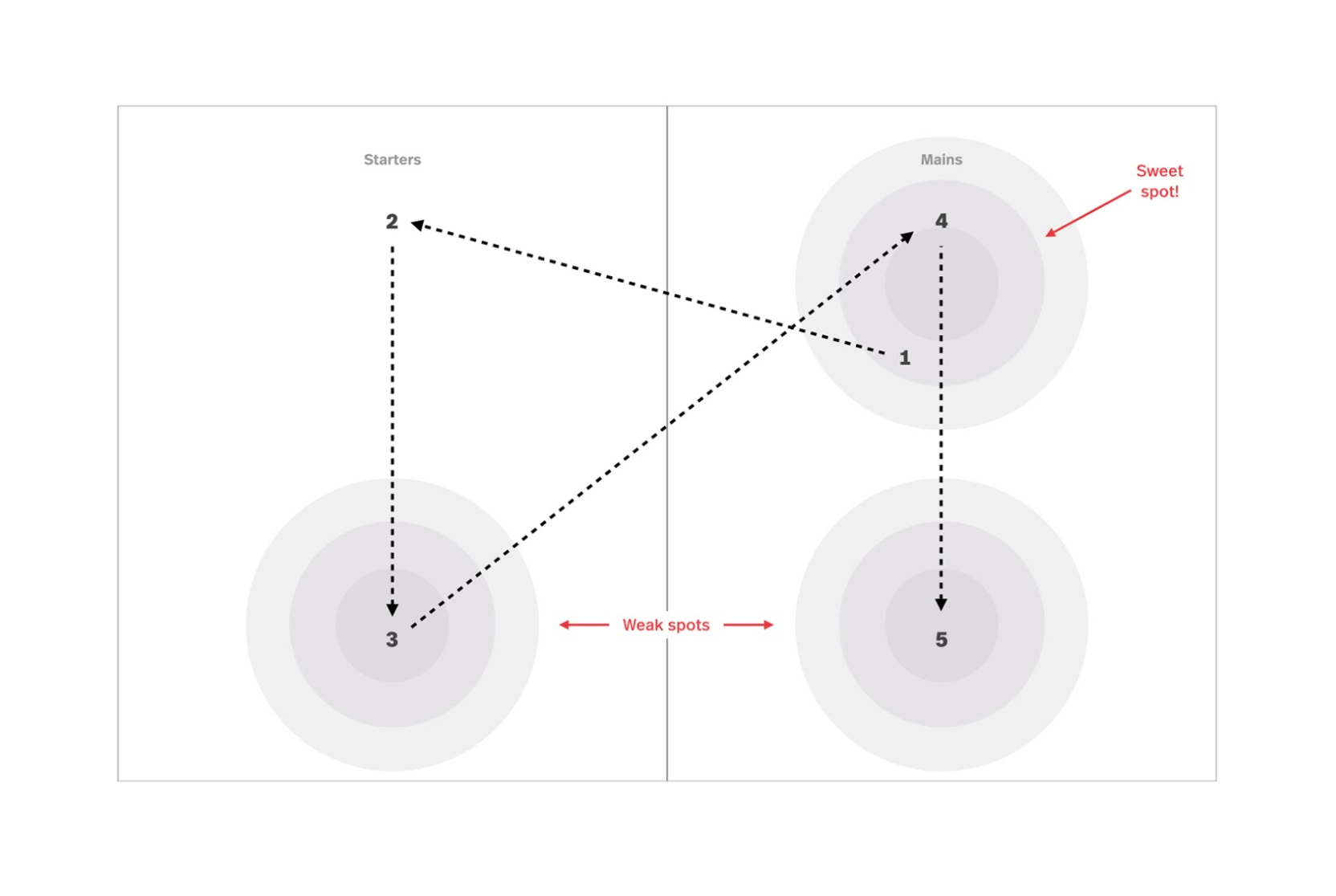 On a two-page menu, guests typically spend most of their time looking at the centre of the right-hand side (known as your “sweet spot”), followed by the first and last items of each column. Place your highest-profit dishes and biggest sellers in these areas so that they’re the first thing your guests see.
Emphasise your Stars and Cash Cows
Along with using sweet spots to your advantage, you can use “eye magnets” to draw your guests’ attention towards certain dishes.
Eye magnets can be a photo of the dish, a graphic illustration, a differently coloured box, a border, or any other attention-getter that makes that dish or area of the menu stand out from the rest.
For example
This menu groups the most expensive menu items together, surround them with a frame and includes graphic illustrations. The result? Your eye is intentionally drawn to that area of the menu first.
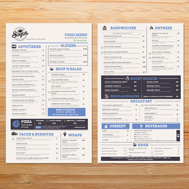
Image source: 99designs.com
Be strategic with which menu items you use eye magnets for. The more you use, the less impact they have. Limit yourself to one eye magnet per menu category (appetisers, entrees, main courses, etc). With that in mind, try only using eye magnets for your Star and Cash Cow items.
Use photos and graphic elements wisely
The volume of photos you use in your menu, along with the overall effectiveness of those photos, depends on what type of restaurant you’re running.
Pairing every menu item with a photo is commonly associated with fast food, low price point establishments. That’s why high-end restaurants tend to avoid over-saturating their menu with photos—they don’t want their restaurant to come off as looking cheap. Alternatively, If you want your restaurant to look high-end and are cautious about using photos, consider using graphic illustrations instead.
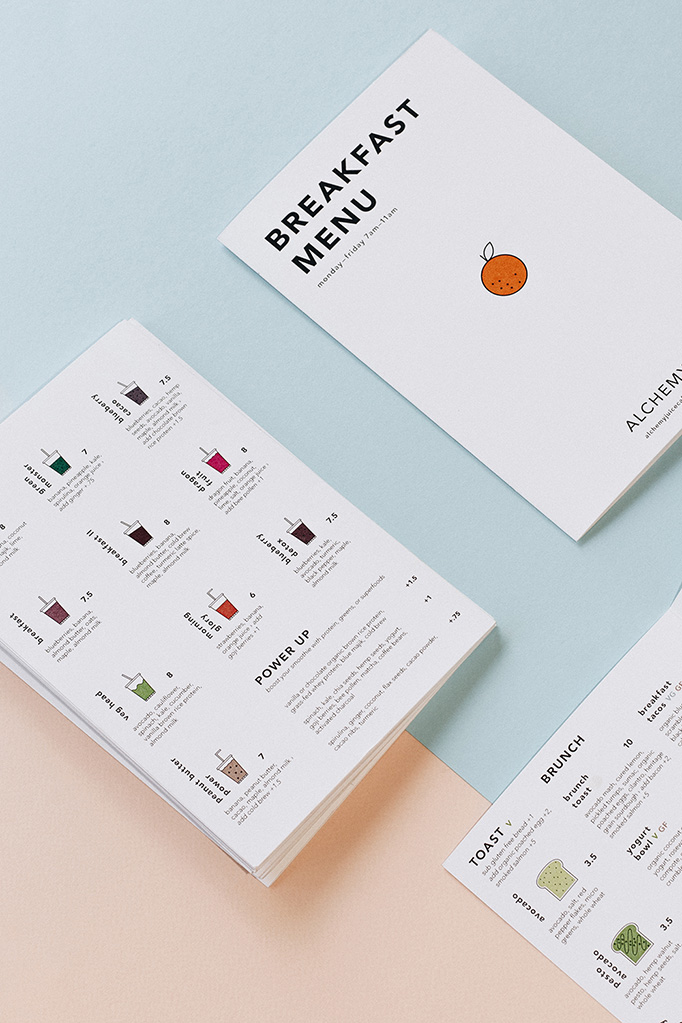
Here, Alchemy shows how to use graphic illustrations and have great visual results.
Menu Engineer Gregg Rapp reports that for mid-range, affordable restaurants, featuring one image per page can increase sales of that item by as much as 30%. So if you’re going to use a photo, consider using them wisely and featuring the dishes you want to draw more attention to.
Low-quality images defeat the purpose of featuring a photo in the first place. They can make your food look less appealing than it actually is. If you feature images, ensure that they capture the dishes ingredients, colours, and textures—and don’t forget presentation! Take the time to plate each dish.All the pros are doing it.
How to write a restaurant menu
You want your menu to be as easy to read and understand as possible while describing each dish in a way that sounds interesting and enticing to your guests.
Your challenge is to keep the number of words you use to a minimum while ensuring that each word is necessary and has an impact. Here’s how:
- Write air-tight menu item descriptions
- Use descriptive adjectives
- Mention the origins of ingredients
- Don’t use dollar signs
- Shift attention away from price
- Use decoys
1. Write air-tight meal descriptions
Make sure that descriptions are short and to the point.
Your customers may be short on time, so a lengthy description will only make your menu harder to read and slow down your table turnover rate. Try to describe each meal in two lines. Focus on the necessary information: its ingredients, flavour, texture, and origins.
2. Use descriptive adjectives
Adjectives are your friend as long as you use them in moderation.
They help your guests imagine the texture, appearance, and taste of each meal. For instance, words like rich, creamy, smooth, and zesty paint a nice picture. You want your copy to ignite their senses.
3. Mention the origins of ingredients
Mention where your ingredients come from, whether they’re locally sourced or from another region. “Sun-ripened Italian tomatoes” sounds a lot more enticing than just “tomatoes”, doesn’t it?
4. Don’t use dollar signs
Dollar signs cause your guests to choose the least expensive options.
Why? Because any currency symbol immediately makes your guests think about the pain associated with spending and inadvertently causes them to shop based on price, rather than what they really want.
The Centre for Hospitality Research discovered thatcustomers spend significantly more when a menu doesn’t include dollar signs.
You want your guests to pick the meals that stimulate their senses, regardless of price—and removing the dollar sign can help you discretely make that happen.
5. Shift attention away from how much the dish costs
Building off the last point, you want to avoid placing your menu item prices in an easily scannable column.
Why? Because it causes customers to focus on a meal’s price, which can result in them choosing the cheapest option. Instead, consider making your prices a little less visible and placing them beneath the dish’s description.
6. Use decoys
Another way to distract your guests from price is to use a decoy menu item.
Place an exceptionally expensive item within close proximity of the item you really want your guests to buy. The more expensive item makes all items around it seem like a more reasonable option, increasing the probability that they are chosen (which is exactly what you wanted in the first place).
How to create a cocktail menu
If your restaurant has a liquor license, you’re going to want a solid cocktail menu.
The same primary steps described above apply to profitable cocktail programs: analyse your sales data, create a menu matrix, adjust your cocktail prices and feature your stars, cash cows and re-worked puzzles.
That’s how you assure that each cocktail is driving revenue.
1. Analyse your cocktail sales reports
To improve your cocktail menu’s profitability, you first need to base your decisions on your historical sales data. Thankfully, your point of sale should be able to pull intuitive sales reports for a given timeframe.
When determining a cocktail’s profitability, look at the total number of units sold, rather than the profitability of a single unit. High-profit items will not positively impact your business’s financials if you do not sell a high enough volume.
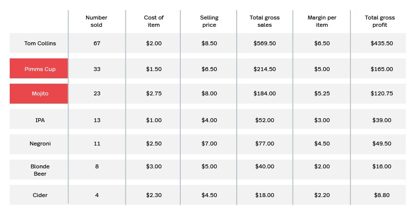
For example
Imagine this is your cocktail menu’s monthly sales data.
That data indicates that both the Mojito and Pimms Cup are popular, so much so that you believe you can raise their selling price without negatively impacting their sales volume.
You decide to raise the selling price of the Pimms Cup from $6.50 to $9.00 and the selling price of the Mojito from $8.00 to $11.00.
Prior to adjusting their prices, your total gross sales for those two drinks was $398.50 per month. Assuming the sales volume for those cocktails remains consistent from month to month, those two price adjustments will raise your total gross sales from those two cocktails to $550—that’s over $150 sales per month and $1,800 per year!
And that’s only from adjusting two cocktails. Repeating this exercise for each of your popular menu items can raise profits exponentially.
2. Adjust your cocktail prices
Imagine you sold a high volume of your cash cows, stars and reworked puzzles, but were still operating your business at a loss. That’s exactly what we want to avoid.
Typically when this happens it’s due to having set prices that don’t cover COGS, labor and overhead expenses, as well as profit once all those expenses are paid for.
To achieve this, we suggest marking up each cocktail’s selling price to be between 100% to 300% higher than its COGS.
That might sound like a big number, but that markup is going to cover a lot of expenses: COGS includes your garnishes, glasses, labor, rent, tools and even your cocktail napkins. In addition, each drink you sell needs to contribute to paying your commercial space’s lease, which can account for up to 30% of all revenue.
For example
Let’s say you want to adjust the selling price of your Tom Collins (priced at $8.50), one of your establishment’s best sellers. Initially, you based your pricing strictly off the COGS plus 300%.
| Ingredients | Cost |
| 1 oz. of lemon juice | $0.05 |
| 2 oz. of carbonated water | $0.75 |
| 1 ½ oz. of gin | $2.00 |
| ½ oz. of simple syrup | $0.03 |
Total cost to restaurant: $2.83
Price to customer: $8.50
Cost: 30%
But this price doesn’t account for labor, your lease or the garnishes you use. Let’s assume it takes your bartender two minutes to make a Tom Collins.
| Other expenses | Cost |
| Napkin | $0.03 |
| Labor ($11.00/hour) | $0.36 |
| Rent per hour | $0.18 |
Total cost to restaurant: $2.83 + $0.57 = $3.40
Actual cost: $3.40 ÷ $8.50 = 40%
Once you take labor, overhead and other expenses into account, your drink’s actual cost jumps by 10%.
If you mark up the true price of your Tom Collins by 300%, it’s sales price jumps from $8.50 to $10.20. That’s a difference of $1.70 per sale.
Considering you sold 67 Tom Collins last month, that’s $113.90 in lost revenue. When annualised, that’s a loss of $1,366.80!
Even the number of napkins you use has an impact on the profit you get from a drink. Include these expenses in yourselling prices from the onset so that you can assure that you’re able to cover all your establishment’s expenses while still turning a profit.
3. Select which cocktails to feature on the menu
Of course, you should take special orders from guests if you have a bartender on staff. Your cocktail menu, however, should be reserved for the drinks you want to put direct emphasis on.
In fact, menus with fewer options are actually better.
Customers get overwhelmed when they’re presented with too many choices and, as a result, are less satisfied with the decisions they make (should I have ordered the Mojito instead of the Pimms Cup? This is also known as fear of missing out (FOMO).
Remember the menu matrix from before? Here’s where it comes in handy. Feature only your stars, cash cows, and re-worked puzzles on your menu. Your duds—the menu items that aren’t popular nor profitable—should be eliminated from your menu entirely.
Chris Tanner, head barman at London hotspot The Vault has a few other considerations for creating an amazing cocktail menu:
Stay true to your restaurant’s personality
Similar to your restaurant’s main menu and interior design, you want your cocktail menu to reflect your restaurant’s brand.
Don’t be afraid to be a little quirky—a unique cocktail menu can help you differentiate your establishment’s experience from its competitors and develop a loyal customer base. Know what you want your restaurant to represent and commit to that vision.
Stay on top of seasons and trends
You want to give customers a reason to keep coming back time and time again. To do that, consider imbuing classic cocktails with a special seasonal twist. It’s a simple way to refresh your menu without too much effort.
Is it cold and wintery outside? Perhaps a winter-spiced Negroni will do the trick. Summery? Forget the drinks that warm you up and go with a fruity Tom Collins. The trick to keeping your cocktail menu fresh is to add a seasonal element to the classics.
Create a strong narrative
Your menu needs to be easy to read and have a clear narrative from beginning to end.
“It’s difficult to engage with a menu if it’s all over the place,” says Tanner. Like any writer, a pub owner needs to engage their customers with the story they’re trying to tell.
One method for building a menu narrative is to have a theme that links everything together. For example, you can select ingredients that are related either by season or their country of origin. You could also base your theme on your establishment’s location.
Anything can be a theme, just make sure that it’s distinct and easy for your customers to understand.
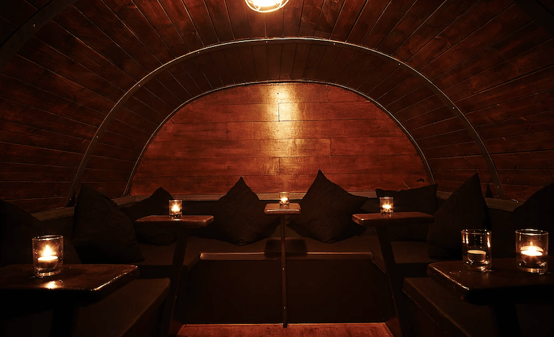
For example, The Vault is located underneath one of London’s oldest whiskey shops. They use their heritage location as inspiration for each of their drinks by elevating classic cocktails with subtle, modern twists. Each drink aligns with The Vault’s brand, which creates an even more cohesive guest experience.
Produce quality over quantity
For Chris, pub owners and operators should prioritise delivering quality over quantity; it’s the biggest factor in fostering loyal, repeat customers. This approach also enables you to raise your menu item prices.
“Since the financial crisis, people are spending less often but actually spend more per outing. They want quality over quantity when they go out for a drink,” he says.
Using high-quality ingredients makes a big difference in a cocktail’s taste and quality. Choose high-quality spirits and fresh, seasonal fruit and herbs to bring a more intense flavour.
Of course, when you use high-quality ingredients, your COGS per menu item will also increase. If you choose to take this route, be sure to adjust your cocktail’s prices accordingly as we explained above.
Create a profitable restaurant menu
The reason why many establishments fail is due to a poorly priced menu: from pricing and concept to which items it features. When executed haphazardly, these factors can be detrimental to your establishment’s profit margins.
By analysing your sales data, creating a menu matrix, adjusting your menu item prices and carefully selecting which dishes and cocktails to feature, you can create a menu that’s both profitable and compelling for your customers—from seasoned foodies to first-time explorers.
You have the information, you have the tools — you even have free customisable menu templates. You’re a menu design wizard.
Are you ready to build your perfect menu?

News you care about. Tips you can use.
Everything your business needs to grow, delivered straight to your inbox.
