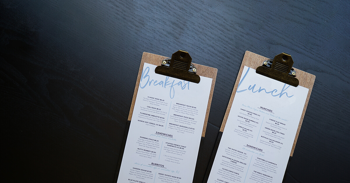
Your restaurant’s menu design is one of the first things (besides your website and interior design) that get your guests’ attention. Together, they form your restaurant’s brand identity. The best-designed menus will subtly influence your guests’ purchasing decisions while communicating your restaurant’s brand loud and clear.
But creating a cohesive, effective menu isn’t easy. Sometimes, you need a little inspiration. That’s why we’ve sourced some of the best menu designs for cafes, bakeries, bars, quick service and full-service restaurants.
Create your menu in minutes
You don’t need to be a designer (or hire one) to create a beautiful menu. Download your free, easily-customisable menu templates today.
Winner: cafe menu
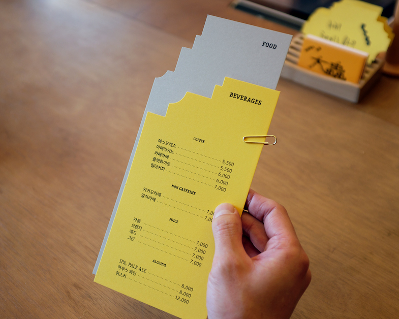
When it comes to inspired design, Daechung Park Cafe in Seoul, hits their menu out of the park. Part of what makes this menu stand out is that its part of a seriously cohesive design strategy.
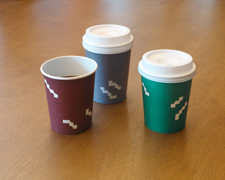
Their menu, coasters, cups, napkins, typography, and logo all play with beveled edges, which is the de-facto distinguishing feature of the cafe’s interior. Together, it adds up to a thoughtfully-crafted, unique identity that’s consistently referenced at every major guest touchpoint.
What this menu did right
- Not using currency symbols
- Keeping the menu list short
- Using a unique cutout that matches the cafe’s aesthetic
- Having a cohesive colour palette
Winner: quick-service juice bar menu
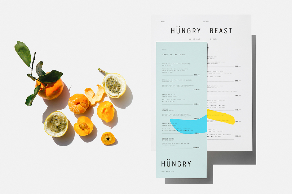
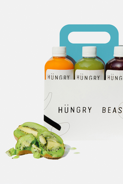
Hüngry Beast’s menu takes the cake for this category. This casual spot in Mexico City uses organic ingredients to create high-quality, healthy snacks and fresh-pressed juice, which certainly inspired their menu’s design.
Their visual identity features a lot of neutral space, with a tasteful splash of colour to represent their no-nonsense, natural juices. A clean colour palette and layout, paired with a strong, easy-to-read font results in a menu design that’s as fresh as the ingredients they use.
What this menu did right
- Great balance between neutral and vibrant colours
- Keeping the menu list short
- Easy-to-read font
Winner: casual sit-down restaurant menu
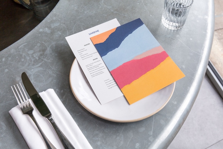
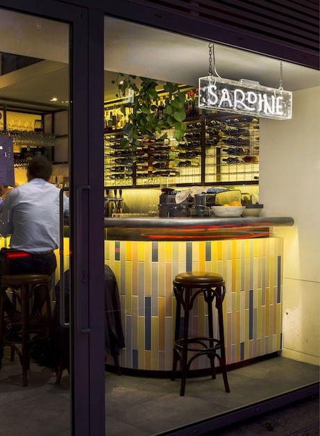
Sardine’s menu features rustic French and Mediterranean dishes cooked over a wood fire. Similarly to Daechung Park Cafe’s menu, Sardine’s is well-executed because of how it uses the restaurant’s interior design as inspiration.
The colour-blocking they use for their menu and business cards reflects the tile pattern of their open-concept kitchen — the establishment’s centrepiece. Bonus, the imagery looks like colourful, abstract ocean waves, a trademark of the Southern French and Mediterranean landscape.
What this menu does right
- Communicating the restaurant’s regional inspiration
- Using the same color palette consistently
- Balancing neutral and vibrant colors
Winner: wine list menu
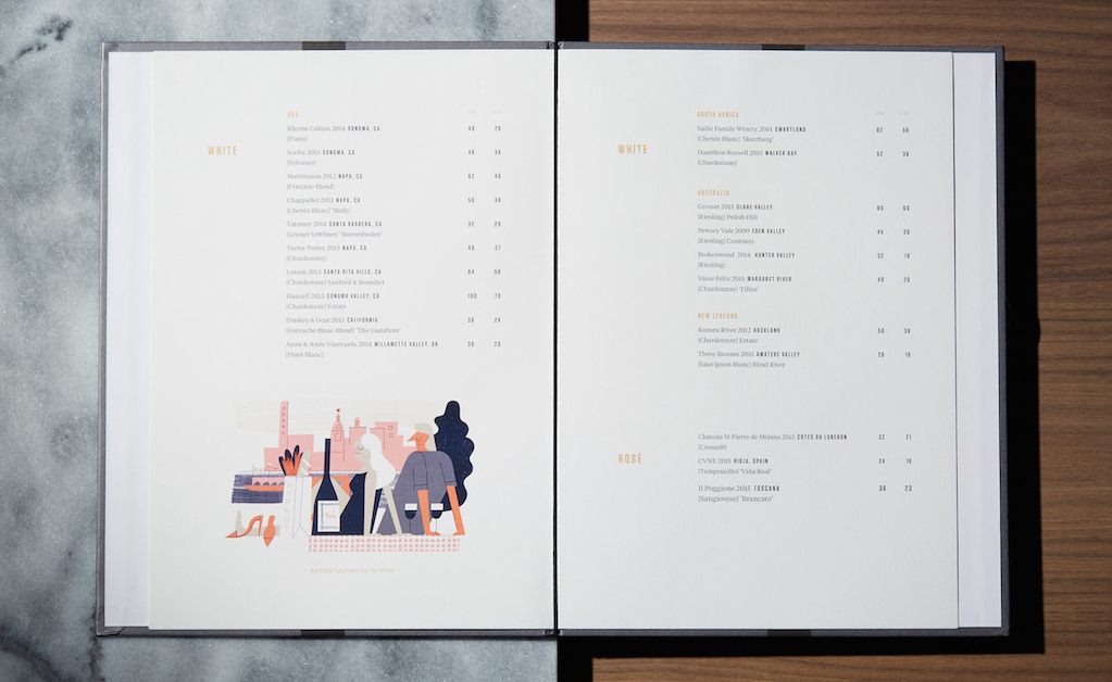
Texas-based wine bar High Street Wine Co. crafted a beautiful menu that perfectly reflects its distinctive interior design.
This menu does a lot of things right. Considering it’s an upscale wine bar, High Street Wine opted to use cheerful graphic illustrations to inject a splash of colour to an elegant layout. Moreover, The illustrations reference the establishment’s communal aspect; they showcase people enjoying moments together over a bottle of good wine. Bonus points for brand continuity; they use similar illustrations on their coasters!
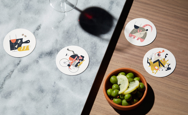
What this menu does right
- Injecting colour with graphic illustrations that tell a story
- Categorising menu items into an easy-to-read format
- Using decoys (see below) to make certain items look more alluring
- Using a two-page format to increase readability
- Not using currency symbols
Wait, what’s a decoy?
Winner: fine dining restaurant menu
L’Avenue’s menu is the epitome of “less is more”. Don’t mistake the minimalism for laziness, this is one well-thought-out menu.
Particularly for fine-dining restaurants, food photography isn’t recommended. Why? Because it’s a design style that’s commonly used by fast-casual restaurants. As such, photos tend to make a restaurant seem cheap, even if the prices say otherwise.
Alternatively, L’Avenue’s minimalist approach immediately makes you feel like you’re dining at a seriously upscale establishment. Bonus points to their menu engineer for using decoys: they strategically place a $200.00 bottle of wine next to the $80.00 bottle — making it look more affordable and desirable in the process.
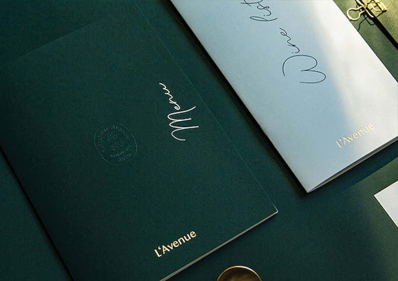
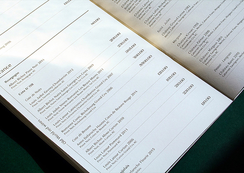
What this menu does right
- Tasteful, minimal branding
- Not using currency symbols
- Using decoys to make certain items look more alluring
- Mentioning each item’s origins
Winner: upscale seafood restaurant menu
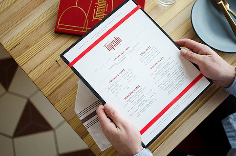
Seafood restaurantTopside did an amazing job of thoughtfully laying out their menu items and fitting their menu design into their upscale mid-century aesthetic.
To go along with a bold red and gold colour theme, they also use a minimalist graphic illustration to highlight the dishes that they want guests to try — their mussels and clams.
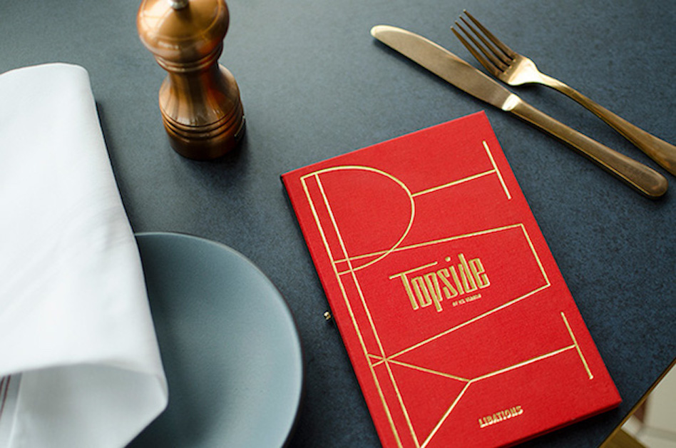
What this menu does right
- Using a two-page format to increase readability
- Categorising menu items into an easy-to-read format
- Communicating the restaurant’s mid-century inspiration
- Using graphic illustrations, rather than actual photos
Winner: graphic illustration use
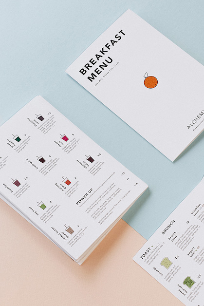
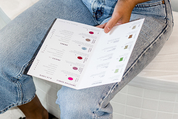
Columbus hotspotAlchemy did an excellent job of balancing their minimalist menu with colourful graphic illustrations for each menu item. The youthful illustrations offer small pops of colour and help balance what would otherwise be a massive neutral space. We predict a mob of Millennials going to this place for a post-workout power bowl, smoothie or avocado toast (or all three)?
What this menu does right
- Balancing neutral space with splashes of colour
- Using a two-page format to increase readability
- Easy-to-read typography
- No currency symbols
Winner: family-style restaurant menu
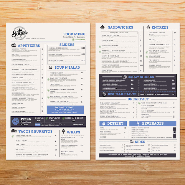
Family-style restaurants need a menu that has enough choices for groups of people with different tastes, which is exactly why Las Vegas-based Sagos’ menu is a standout.
This menu could have easily felt crowded and stuffy just because of the sheer volume of choices, but it doesn’t. Why? Because it uses a relatively neutral colour-palette to offset all the text, and strategically uses dark blue boxes to draw attention to the dishes that they want customers’ eyes to gravitate to first.
What this menu does right
- Careful use of eye magnets (see below) to draw attention to certain dishes
- Easy-to-read typography
- No currency symbols
Wait, what’s an eye magnet?
And there you have it!
Each of the above menus are strong for a variety of reasons, but the key takeaway here is that a thoughtful, well-planned and executed menu design makes a big difference in how your establishment is perceived and how much guests spend.

News you care about. Tips you can use.
Everything your business needs to grow, delivered straight to your inbox.


