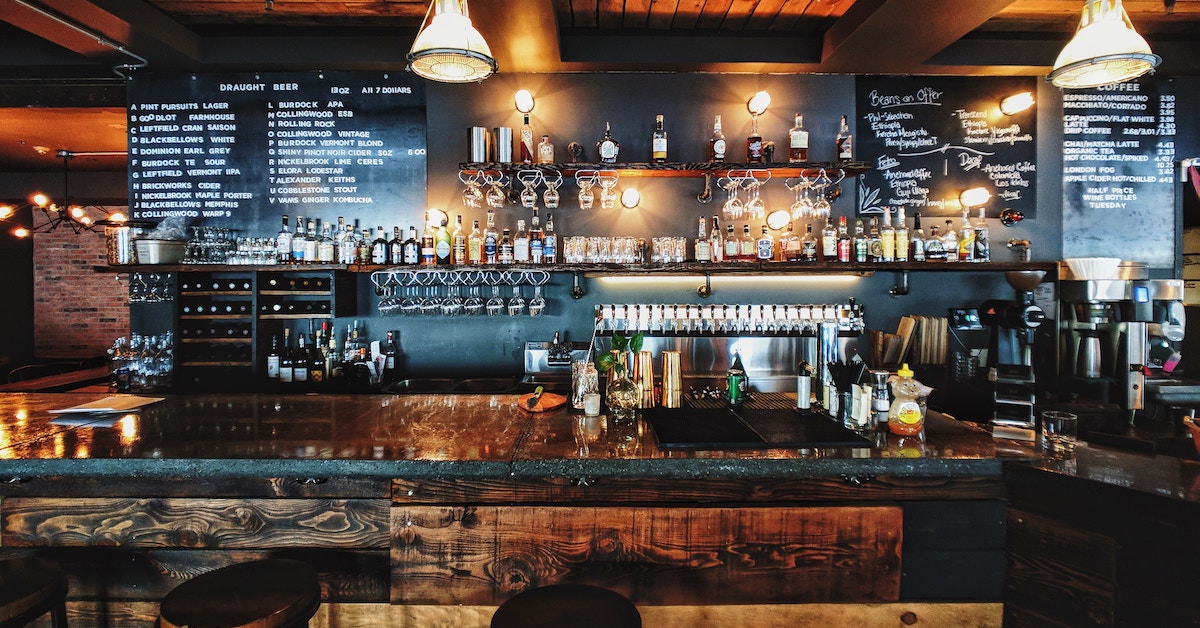
Opening a restaurant can be daunting. There are many factors that play into your restaurant being a success or fizzling out. Whether it’s how attentive you and your staff are to your customers’ needs or if the food and drinks you serve meet their expectations, there’s a lot of pressure to be at your best, every day — becauseyou never know who might walk in.
One of a restaurant’s most valuable secret weapon’s for attracting, satisfying and retaining customers is its interior design. The aesthetic of a restaurant communicates an experience to visitors and should be considered a critical extension of its brand image. If customers love the vibe, they’ll share their experience with their friends and followers.
The power of word of mouth
Word of Mouth Marketing (WOMM) is becoming increasingly visual, and an Instagram post or story from a trusted source is simply more convincing than a paid ad. According to Nielson, 92% of consumers believe recommendations from friends and family over all forms of advertising.
Let’s not forget that Instagram has over 800 million monthly active users, with 80% of them following businesses and 60% discovering businesses for the first time using the channel. One nice photo from an influential account has the potential to attract a lot of new customers, so it’s important to consider how viable your restaurant’s aesthetic is for powerful visual marketing channels like Instagram.
Consumers are increasingly discovering businesses through their social media channels and believing the recommendations of their peers more than ads, so your goal is to enable influential customers to take great pictures and convince their followers that your restaurant is a must visit.
Here are the top things to consider when planning and executing the aesthetic of your restaurant:
1. Your aesthetic is an extension of your brand
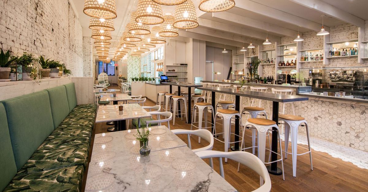
When you start conceptualizing your desired aesthetic with a designer and architect, it’s important to base every decision around the values of your restaurant and the customers you want to attract. Take LOV, a bustling vegan hotspot in Montreal. Designers Jean-Pierre Viau and Jacinthe Piotte wanted to create an environment that could work day and night, starting fresh and airy, and becoming cozier as the night progressed.
They also wanted the decor to pay homage to LOV’s plant-based menu and retain the beauty of the restaurant’s heritage building. The result is a clean, fresh color palette with plenty of plants, gold, and white marble.
The beautiful interior design, paired with great customer service and delicious meals, led to LOV gaining a strong social media following, expanding from one to three locations, and establishing itself as the go-to vegan restaurant in Montreal. Their notoriety even led to their signature dish, kimchi fries, being featured on the popular Buzzfeed series “Worth It”.
2. The accessories you choose speak volumes
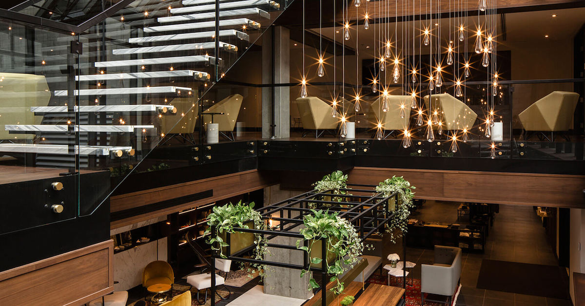
Your restaurant’s accessories aren’t just for decoration; they’re a way to showcase status and wealth. The accessories you choose immediately identify your space—including its social and cultural purpose—and transmit that identity to your audience. Invest in your restaurant’s details so they reflect the desired persona of your restaurant—whether it’s fast, casual, fancy, or a hybrid.
3. Lighting, lighting, lighting!
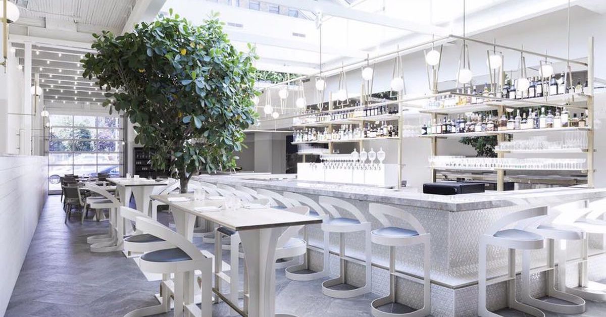
The lighting you choose depends on the theme of your restaurant and the emotions you want customers to feel. More often than not, natural lighting is the way to go because of its psychological benefits. Studies show that people exposed to natural lighting show signs of improved acuity and mood, whereas those exposed to artificial lights showed higher levels of stress and metabolic activity.
Perle et Paddock, a restaurant in Montreal’s Griffintown, is a bustling yuppie hotspot. The dining space is open, airy and has plenty of windows, which is certainly appreciated by the restaurant’s customers. Not to mention, all the natural light provided by its prominent sunroof makes taking great photos far easier. Encourage social sharing with lighting that makes even amateur photographs look enticing. Remember, even the images your customers share is an extension of your brand image.
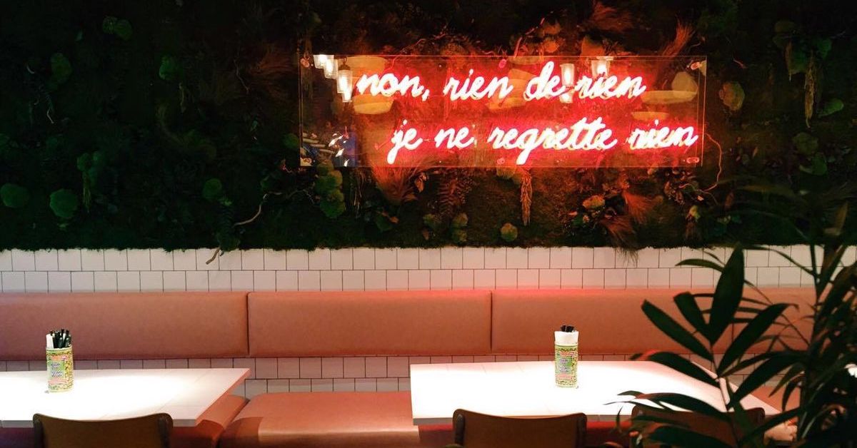
Speaking of lighting, neon signs are a great way to add creative flair to your interior design and give your guests something to share with their friends! It’s also a great way to showcase your restaurant’s personality. This sign, located in Montreal’s Kampai Garden, says “I regret nothing”. It might not be that visible for their lunch and dinner service, but as soon as the sun goes down, the lights get dimmed and customers hand/eye coordination falters, it’s there. Ready for the group selfie.
4. Who is your target consumer?
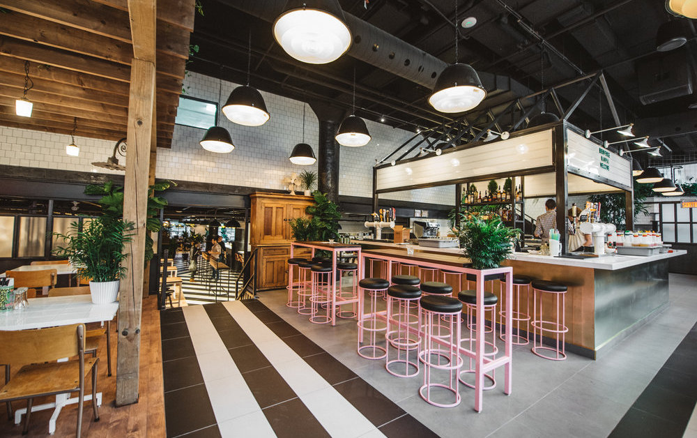
Restaurants are social spaces that bring people together. Whether your customers use your space for business meetings, to meet with friends, host celebrations or unwind after a long day at the office, your space needs to nonverbally communicate a set of expected customer behaviors.
Take, for instance, Kampai Garden, Montreal’s premiere “Beer Garden”. Serving brunch, dinner, side dishes and delicious cocktails, this hotspot aims to please various crowds: from professionals on their lunch break to University students looking to party with friends. Kampai Garden’s expansive location has several unique spaces that each meet specific customer requirements.
Their bar area immediately communicates that this is a place where you can grab a drink and socialize in a trendy (very Instagrammable) setting, while their dining area pays homage to the beer garden theme with a seemingly endless amount of plants throughout the space.
Kampai Garden has taken into account that they have several target consumers from different demographics, and created experiences that satisfy each of them. A huge undertaking to design, but visitors consistently rave about the atmosphere and—more importantly—contribute to the restaurant’s local notoriety by sharing their experiences with their followers on social media.
5. Offer a variety of experiences
Each of the showcased restaurants has something themes in common, the most critical being that they each offer a variety of experiences. You can sit at the bar and have more personalized experience as the bartender guides you through your meal, an intimate table for two, a cozy space with couches and banquets, or long, communal tables. Whichever setting you’re looking for, the restaurant can provide. This variety assures that you are welcoming as many types of customers as possible.
Invest in interior design to drive traffic to your restaurant
These are just a few of the things to consider when you start conceptualizing how you’re going to communicate your restaurant’s brand with your target audience. Think of interior design as a set of powerful non-verbal cues you can use to gain notoriety and attract customers. When paired with an awesome menu and top-tier service from your staff, you can separate yourself from the pack and transcend from just another restaurant to an institution.

News you care about. Tips you can use.
Everything your business needs to grow, delivered straight to your inbox.


