A store is a 3D representation of what people see online–it has to offer a sensorial experience if it wants to compete in this day and age. Retail design is a big part of that, and it’s why we spoke to Debbie Kalisky of GH+A, leaders in merchandising strategy and retail design in Canada and the United States.
Q. What should retailers keep in mind when selecting a storefront location?
Before thinking about design, the most important thing to consider is the street (or mall) location. You’ll want to be close to popular stores in an area with a lot of foot traffic. Think location before interior design!
Visibility from the street is also super important. Make sure the store isn’t set back or overshadowed by another building. Good transparency is also crucial–you should be able to see inside from the street, so make sure there’s a very large glass storefront and not just a small window.
Q. How can a retailer make the best use of a multi-level space?
It’s better to have an escalator than stairs, but of course that’s really expensive for most retailers. For stores with two floors, make sure there is something really enticing upstairs that you can see from the main level. Whether you have an eye-grabbing sculptural element suspended from the ceiling or large visible promotion, you have to give people a real reason to walk up the steps or they’re likely to save that workout for the gym!
Q.Interior design/decor on a budget – advice please!
Big, bold graphics. Lifestyle images that convey what your store is all about, buzz words, and marketing images from the brands you carry, can all be used as wallpaper. Crown mouldings or really intricate paint jobs shouldn’t be the focus for a retailer on a budget. Forget those details and do really big graphics that make a statement and create intrigue.
Q.What about renovating on a budget?
Of course that really depends on the state of the space when you move in. I love finding exposed brick and industrial elements, like exposed pipes on the ceiling. Sometimes a more urban or “rough” interior can look amazing as the backdrop for high end, polished items (but only if it works with your brand identity).
Q. What should a retailer keep in mind when it comes to choosing the right colors?
Firstly, a retailer should know their target customer and the area’s consumer demographic before they even decide on a color story. There are so many variables to consider such as the kind of ambiance you’re trying to create, who you are selling to, and where your store is located. You can imagine why certain stores might look mismatched with the “lifestyle” of a certain neighborhood.
Secondly, stay away from cliche rules. I’ve heard that blue should never be used in a kitchen or around food, and some customers have asked me if white always makes a space feel bigger. My answer is that that’s not always the case, and then I ask them why they want to make a store look bigger in the first place. I’ve seen amazing stores that are all black and have a dramatic impact. When deciding on your color story, consider what your brand conveys as well as the brands you carry. Retailers can look at similar stores they like or social media like Pinterest to get ideas.
Q. What should a first time retailer look for when choosing shelving and in-store displays?
Look for a system that’s flexible. Stores should remain interesting by being remerchandised on a regular basis. A retailer wouldn’t want to be stuck with something too static, so they should look for modular units that can be switched around each season.
Q. Can you tell us what the most important design trends are in retail (in your opinion)?
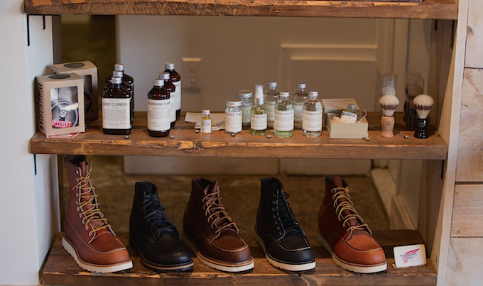
Stores today are all about communicating a lifestyle, not just a particular set of products. In terms of merchandising, cross-merchandising is almost a must. A footwear retailer will sell shoes along with accessories and footwear-related products. You might want to sell books, gourmet treats, and hand creams along with kitchenware. It’s all about creating vignettes that embody a lifestyle.
In terms of store layout, we’ve seen a lot of retailers moving away from the traditional checkout counter. A lot of stores transact using mobile devices now, which means there’s no need for a big desk or counter area. We recently did a store in Toronto that had an espresso corner where customers could relax with a coffee while the associate checked them out on an iPad. For retailers that want that final transaction to be at a counter, we’ve been seeing much more elaborate displays behind the cash such as screens showing fashion shows. Technology now plays a huge role on the physical layout of a store.
GH+A is an international retail design firm leader. They create dynamic environments for stores, shopping centres and mixed-use projects, in addition to their strategic brand positioning.

News you care about. Tips you can use.
Everything your business needs to grow, delivered straight to your inbox.


