When it comes to menu design, you want it to look good. Of course. But you don’t want your design to clash with your ultimate goal: maximising sales.
And, believe it or not, there are some features in menu design that do just that. Below are three common culprits that are responsible for tightened purse strings.
1. The dollar sign ($)
Does the dollar sign ($) next to the price of dishes make a difference in how they are perceived?
Absolutely. And semantic salience is why.
Semantic: the relationship between the signifier (words, signs, symbols) and their meaning ($ = Money).
Salience: refers to how obvious or noticeable something is, i.e. the degree of attention it draws.
So, semantic salience in this context refers to the amount of attention ‘$’ attracts to the concept of money.
When the dollar sign is used, it becomes the most repeated visual in your menu. This impacts your guests in two critical ways.
- It serves as a reminder that money is being spent, which will make price-conscious guests avoid upsells like desserts and cocktails, and it can even urge them to pick cheaper dishes on your menu.
- Having the dollar sign littered all over the menu also positions your establishment as a money-making endeavour. This detracts from the dining experience — your venue appears transactional instead of warm and welcoming.
2. Price columns
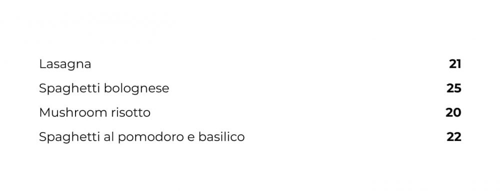
Price column is when the pricing of dishes is presented in one single column, like below:
By having the prices lined neatly in one column, the eyes tend to divert to the price column for a quick scan. Oftentimes, when this happens, the price of the dish influences your guest’s decision rather than the appeal of the dish itself.
Price columns also increase the chances of price comparisons. From the example above, a guest looking for a pasta dish may opt for ‘Spaghetti al pomodoro e basilico’ over ‘Spaghetti bolognese’ even though they were inclined towards the latter.
3. Price trails
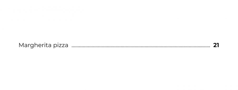
Price trail refers to the dotted line that connects a food item to its price, like below.
The trails are usually there to assist your guests with navigation towards the price. And that is exactly the opposite of what your menu should be doing. The dishes and their descriptions should be the deciding factor for your guests, not the price.
A price trail not only strengthens the relationship between dishes and pricing, but it also makes the price the first thing your guests notice. What’s worse? It doesn’t happen naturally, it’s caused by your menu design.
Money talks
At the end of the day, you want your guests to have a good experience, feel that they are getting the biggest bang for their buck, and also achieve your desired profit margin.

To nail that, you need to set the right price (which you can do with Lightspeed Produce) and also strategically design your menu. Consumers are, in most cases, fully aware that they are about to spend money, there is no reason to draw attention to it.
Because money talks; but sometimes, it’s best to keep it quiet.

News you care about. Tips you can use.
Everything your business needs to grow, delivered straight to your inbox.


