Nothing sets your business apart more than great design. Check out these boutique store design tips to get started. Boutique owners often start their business as a labor of love, with a passion for specialty clothing, home goods, soaps or candies that customers can’t get at larger, big-box stores. While much of boutique shopping’s future is likely online, many customers still enjoy traditional shopping (with the proper PPE and sanitation practices in place). You just can’t replace seeing, smelling and trying on merchandise before buying.
But online and in-store don’t have to be mutually exclusive. Smart retail point of sale (POS) systems can help you analyze customer trends and enhance the overall in-store buying experience with the same ease your customers enjoy with online shopping.
Have you considered how your boutique store design affects whether or not your customers purchase from you? Many boutiques have a relatively small square footage of selling space, so making each inch count and keeping customers inside your store—buying instead of browsing—is essential to growing your business.
In this post, we’ll cover:
- Be mindful of the decompression zone
- Add a power wall
- Create a path that flows
- Be thoughtful with your use of space
- Choose a theme that tells your brand story
- Let your lights shine
- Use music to set the tone
- Stay in tune with trends
- Reduce clutter and kitsch
- Slow customers down with speed bumps
- Introduce seating
Run a smarter retail store
Learn how to use cloud-based commerce technology to give your retail business the flexibility it needs to thrive in the new world of retail.
Entering your threshold (aka the decompression zone)
The first five to 15 square feet of your boutique is where your customers transition from window shopping to examining what you have to offer. This “decompression zone” allows them to take in your store’s music, lighting and overall ambiance. It also determines whether they’ll take a quick look around and leave, or discover items that draw the eye and invite them to stay.
This threshold or decompression zone allows customers to make a quick judgment about your store. They’re taking in your theme, evaluating whether your store seems within their budget and deciding if they want to explore it further. Because customers are in “transition mode,” they’re more likely to overlook signage or products placed here. Use this area of your boutique store design to create a small vignette of your classic wares, highlighted with complementing statuettes, framed artwork or fresh flowers. The goal is to sum up the feel of your store in an instant.
Add a power wall
Did you know that upon entering a store, over 90% of Americans turn to their right? This impact wall, or “power wall” is their first encounter with your products and the ideal space to display new items and add exciting artwork installations that complement your products. Having a range of items within easy reach invites customers to move further into your store. Here’s where you can begin to add signage promoting your items, such as a discount on sundresses or a buy-one-get-one deal on soaps.
Your own sales statistics can determine the mix of items you place on your power wall. If there are certain in-demand products, you may choose to place them where customers can see them right away. Other retailers may choose to have their most popular items toward the back of the store, giving customers a chance to check out their other items as they wind their way towards the popular products.
This is a great example from the fitness brand Gymshark, which features a power wall that showcases matching sets. Aside from giving shoppers outfit ideas, this power wall creates a visually appealing focal point that draws customers into the store, encouraging them to explore more of the merchandise.
View this post on Instagram
Create a path that flows
As your customers stroll through your store, whether or not they discover everything you offer depends on how easy it is for them to walk a “sales path.” You’ll want enough space for people to pass while leaving your wares at hand and eye-level.
Remember, if you’re in the U.S., nearly all of your shoppers will automatically turn to the right first. Keep this in mind as you create a layout that funnels them through your store. Consider using two-sided shelves to divide up space, with different items on either side. Useful furniture, such as benches, can be interspersed with shelving, creating a height difference that adds interest to the eyes.
Another option, depending on the size of your store, is to create smaller “pods” or clusters of merchandise according to your theme. A fashion boutique may choose to have scarves clustered together, jewelry and bags in another place and small circular racks of different types of clothing.
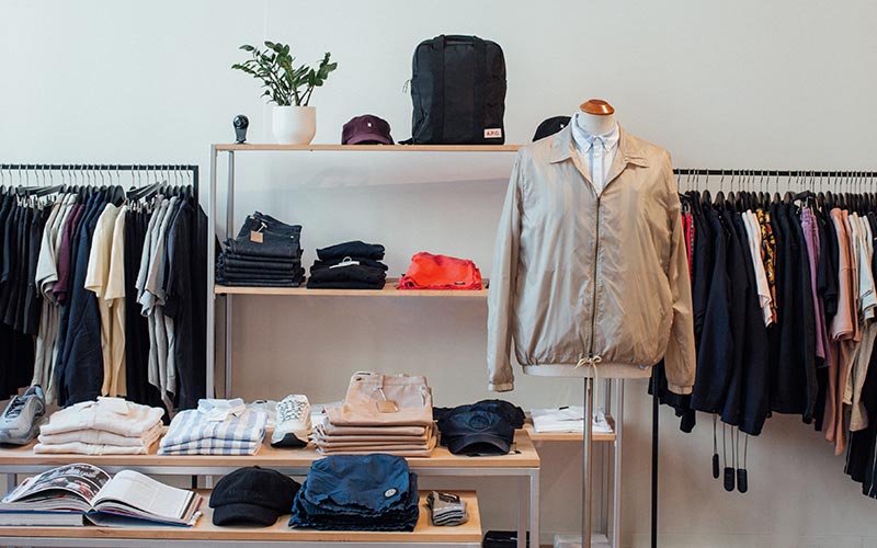
Other retailers choose to intersperse small displays of accessories between tiered clothing racks, with styling suggestions placed on mannequins to make it easier for customers to find each element of a particular look.
As you design your sales path, consider the direction you wish your customers to take. You may want to lead them toward particular items, which you can highlight with bold pops of color, eye-catching displays or brighter signage. You may also choose to use different flooring to guide your customers, where the feet go, the eyes follow. Different colored tiles or a mix of tile and carpet can give an identifiable path for customers. You can then choose to change the “ends” of each aisle or path seasonally to showcase monthly or quarterly specials.
You may also choose to have more than one checkout area located within these mini-departments. Streamlined, tablet POS systems are unobtrusive and make paying simple for customers, without creating a long line that may interrupt your sales path.
Be thoughtful with your use of space
For many boutiques, an open, uncluttered store layout not only enhances the shopping experience but also increases the perceived value of your merchandise. When customers have room to move freely, they feel more comfortable and are likely to spend more time exploring your offerings.
So, avoid overcrowding shelves and racks with products. Instead, curate your displays to feature a selection of key items that represent your brand’s best.
Incorporate negative space—areas intentionally left empty—to create a sense of balance and sophistication. That way, each product stands out and draws attention to specific items you want to highlight.
Need inspiration? Check out what Sunmed, Your CBD Store is doing. The retailer keeps most of its products on its wall shelves, so the floor remains open and spacious. This setup lets customers move around easily and comfortably while exploring the store.

Choose a theme that tells your brand story
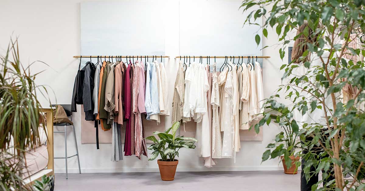
The theme of your store ties your décor elements into your brand’s story. A retail business owner who sells handcrafted soaps, home scents, and skin care may choose to incorporate elements of nature into their themes, such as muted colors, live plants or flowers and a homey interior. A clothing boutique owner, however, may wish to take a more modern approach with minimalist décor and pulsing music to give an impression of cutting-edge trends.
The theme of your shop should help tell the story of your passion. Ideally, shoppers should leave your store with a strong sense of why you chose your niche and product offerings. Personalizing the interior of your store also helps build your brand, especially if you have unique décor or local indie art installations that you just can’t find at major retailers.
The right theme can make your target demographic feel welcome. If you don’t know it already, a good marketing agency can help you identify your primary customer profile, as well as secondary customers.
Whether you cater to young and hip clientele, health-conscious parents or older shoppers, giving a personality to your primary customer will help you determine a theme that appeals to them. In turn, making them feel comfortable and welcome in your store.
Your theme can also help you determine the layout of your store. This makes it easier to change things up a bit for freshness, as you’re working within a design framework that has certain aspects to follow, and ones to avoid. If you aren’t a savvy decorator, consult with a professional designer to help you build a subtle, yet captivating interior.
Let your lights shine
The lighting you choose can make an enormous difference in how long your customers stay in your shop. Yellow light bulbs bring a warm, earthy experience and are easier on the eyes. Bright, fluorescent overhead lights may give off a cold, impersonal vibe, which can become increasingly unpleasant the longer that shoppers spend in your store.
If you’re fortunate enough to have large display windows, make sure they’re cleaned often to give you more natural light inside your store. When you’re decorating your window displays, take care not to block too much of the natural light.
Unique lighting adds to your overall theme. Are you a jewelry store? Unobtrusive, invisible lighting will make your stones glitter and metals sparkle, without detracting from your delicate displays. We can see this in action in the jewelry store Melissa Joy Manning, which uses strategically placed to ensure the space is well-lit wihout overpowering the small dainty pieces that the brand sells.

Or perhaps, you’re a formal, wedding-themed boutique. Adding elements of romantic lighting, such as fairy lights or graceful crystal chandeliers, gives your shop an element of romance and elegance. Gourmet food retailers, or those with other handmade body care items, such as soaps and perfumes, may enjoy a more rustic interior, with metal and glass sculpture lighting to complement their theme.
Using strategic spotlights can draw attention to your display areas and add interest as your customers walk along your sales path. Don’t forget to choose good lighting for your dressing rooms, if you have those. More customers will buy clothing if the rooms are well-lit without glaring bright light than those who feel they’re trying on clothing in a hospital room.
Use music to set the tone
The music you choose allows your customers to feel at home or distracts them from the theme and environment you’re creating. Pleasant music, coming softly from strategically placed Bluetooth speakers throughout your store, can have a calming effect and play into your theme. Loud music, music with risqué lyrics or speakers placed that don’t work with the building’s acoustics, can be off-putting and detract from the shopping experience.
You may consider changing your music depending on the time of day. If you have two or three distinct target customer profiles, you might choose a different playlist on a Saturday night than on a Tuesday morning.
Stay in tune with trends
People shop at boutiques to find something different from national chains. Smaller, designer labels, specialty items or fresh takes on food and wines are popular boutique wares. As a small business owner, your passion for your brand and industry should naturally lend itself to you keeping up with trends.
Fashion tends to run about six months ahead of store stocking. Choose to embrace leading-edge trends right away, with pieces straight off Fashion Week runways and give your customers the chance to be the first to have an item, instead of waiting to be in the middle of the pack.

Garnering a reputation for having the hottest items and being ahead of national retailers, or even just other boutiques in your area, will help you build your brand and give you an air of authority as a professional, knowledgeable business owner.
When you share your newest arrivals with your VIP customer list, you also have the chance to build relationships with your regular customers, turning them into loyal shoppers who enjoy your brand. This, in turn, helps you organically build business through word of mouth. You can also promote your newest arrivals on social media, inviting your customers to engage with your store’s posts.
Reduce clutter and kitsch
Some retailers are tempted to showcase every single item in their inventory to give customers plenty of choices. While variety is a good strategy, having too much out at once can be overwhelming for people. Too many choices often leads to customers choosing nothing.
You may wish to only have a handful of each clothing item on display, for example, and train your staff to tell your customers that you have more sizes in your back storage area. Using small drawers to store extra sizes, while having just a couple on display, can reduce clutter and give your customers access to the sizes that fit them.
Other things to be wary of are too much clutter throughout your shop. Too many displays can overwhelm the eye, instead of drawing customers in to take a closer look. Extra prints on the walls makes your store seem too busy, while too many decorative items mixed into your displays detracts from what you wish to sell. In addition, extra décor means extra cleaning. No one wants to shop in a store with dust or cobwebs!
Instead, opt for vertical displays that work well with hanging items—dresses, blouses, and longer items like necklaces look nicer hanging from hooks instead of lying flat or folded. Cut back on bulky displays to give your customers room to shop and avoid feeling hemmed in by the displays.
For added interest, consider vintage clothing racks or coat trees instead of typical hanging displays. For smaller items, consider mason jars or vintage bowls to add a pop of novelty to a useful display.
Slow customers down with speed bumps
Now, you don’t want to literally trip your poor customers, but you do want them to have time to thoughtfully consider each product display. You can do this by having strategically placed visual breaks.
These visual breaks include signage and highlight merchandise that invites touch. A clothier may choose to display touchable scarves or rings and bracelets that are simple for customers to try on and admire. A gourmet candy company or food store may have a small sample section, with the items featured easily grabbable around the sample display. These “merchandise outposts” usually include impulse buys, but tie together complementing items around the outpost to increase your sales.
You may not have traditional aisles in your boutique, but you can still incorporate speed bump displays by grouping your products in a way that makes sense for your customers. When arranging a multi-tiered display, remember to have your high-demand products at eye level and easily accessible, while those that don’t sell as well lower down or above eye level.
CBD Kratom, for instance, has tables strategically placed in-store featuring seasonal products and promotional materials like posters. These displays naturally draw customers’ attention as they move through the store, encouraging them to slow down and engage with the products on display.

Introduce seating
Adding seating areas to your boutique can enhance the shopping experience and improve your store’s design and layout. Comfortable seating areas provide a space for customers to relax, making their visit more enjoyable and encouraging them to spend more time in your store.
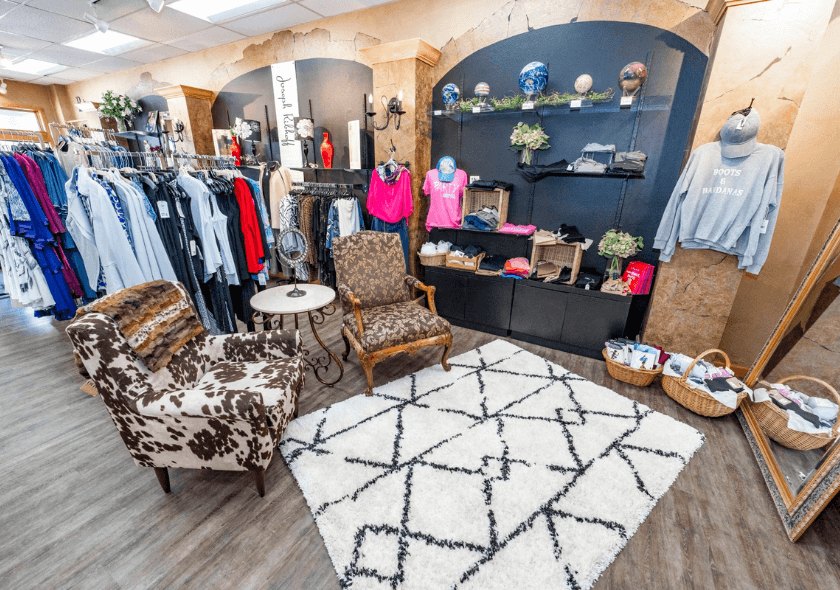
And when it comes to retail design, seating can actually contribute to the overall aesthetic of your store, especially when you choose stylish furniture to reinforce your branding.
Check out this example for the apparel boutique The White Orchid, which has some cozy seating in their shop. (Which is perfectly on-brand, by the way, because they sell lots of cozy clothes.)

Wrapping it up
When creating the layout of your retail boutique, it’s important to look at it through the eyes of your customers. Invite trusted friends and family to give feedback as secret shoppers, use your knowledge of your target demographic to create a theme that appeals to them, and arrange your aisles and displays in a way that paces your customers’ trip throughout your space.
A well-considered floor plan and cohesive design can dramatically boost your sales, help build your brand, and improve overall customer satisfaction. For those with a bit of money in their budget, an interior designer is invaluable. Lastly, have welcoming staff to set your customers at ease.
With the right retail POS system in place, you can seriously level up your ability to create an enjoyable shopping experience. Chat with a Lightspeed retail expert to learn more.

News you care about. Tips you can use.
Everything your business needs to grow, delivered straight to your inbox.


